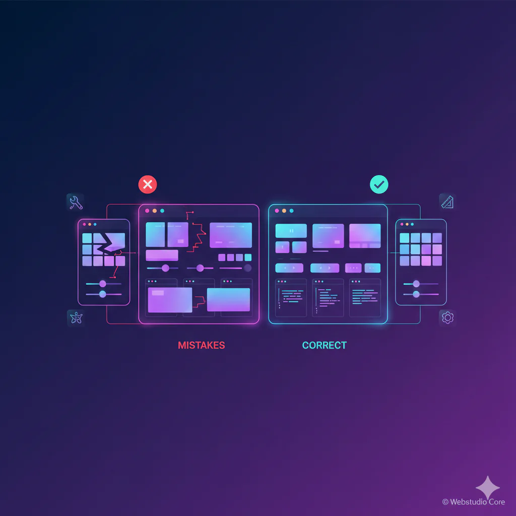
Common CSS layout mistakes continue to appear in modern websites, even among experienced developers. As layouts become more complex and devices more diverse, small structural errors in CSS can lead to broken designs, poor responsiveness, and difficult maintenance. Understanding these mistakes is essential for building clean, scalable, and reliable layouts.
This article focuses on real-world layout issues and practical ways to avoid them using modern CSS techniques.
Overusing Fixed Widths and Heights
One of the most frequent CSS layout mistakes is relying on fixed widths and heights for containers. While fixed values may look correct on a single screen size, they often break layouts on smaller or larger devices.
Modern layouts should adapt naturally. Using flexible units, intrinsic sizing, and layout systems like Flexbox and Grid results in interfaces that scale without constant adjustments.
Using Margins to Control Layout Structure
Margins are often misused as primary layout tools instead of spacing utilities. Pushing elements into position with large margins leads to fragile layouts that are hard to debug.
Layout structure should be handled by layout systems, not spacing hacks. Margins should refine spacing, not define the layout itself.
Ignoring Box Sizing Behavior
By default, CSS calculates width and height without including padding and borders. This frequently causes unexpected overflow and alignment issues.
Failing to standardize box sizing across a project is a subtle but common CSS layout mistake that complicates responsive design and component reuse.
Not Using Modern Layout Systems
Some layouts still rely heavily on floats, inline-blocks, or excessive positioning rules. These approaches were workarounds before Flexbox and Grid existed.
Avoiding modern layout systems leads to verbose CSS and unpredictable behavior, especially when layouts need to change direction or alignment responsively.
Absolute Positioning for Core Layout Elements
Absolute positioning is useful for overlays and decorative elements, but using it for core layout structure is a common mistake.
Absolutely positioned elements are removed from normal document flow, which can cause overlap issues and accessibility problems when content changes.
Poor Responsive Planning
Many layout issues stem from designing only for desktop and fixing mobile later. This approach results in bloated CSS and fragile breakpoints.
Layouts should be designed with responsiveness in mind from the beginning, not patched with excessive media queries.
Overcomplicating Media Queries
Media queries are powerful, but overusing them is another common CSS layout mistake. When every small change has its own breakpoint, layouts become hard to maintain.
Modern CSS features allow layouts to adapt naturally without relying on multiple device-specific rules.
Inconsistent Spacing and Alignment
Inconsistent spacing is often a symptom of unstructured layouts. When padding, margins, and gaps vary arbitrarily, the UI feels unpolished.
Using consistent spacing systems and layout gaps improves readability and visual hierarchy across pages.
Forgetting Content Growth and Edge Cases
Layouts often look correct with placeholder content but break when real data is introduced. Text length, dynamic images, and user-generated content expose weaknesses in rigid layouts.
Testing layouts with extreme and realistic content helps prevent overflow and alignment issues.
Lack of Reusable Layout Patterns
Repeatedly solving the same layout problems in different ways leads to inconsistent code and design.
Reusable layout patterns improve maintainability and reduce the chance of layout-related bugs.
How to Avoid Common CSS Layout Mistakes
Avoiding common CSS layout mistakes starts with understanding layout fundamentals and choosing the right tools for the job.
By relying on modern layout systems, planning responsiveness early, and prioritizing flexibility over rigid rules, developers can create layouts that are easier to scale, maintain, and refine over time.