Building a modern website is not just about visual appearance. A well-structured CSS layout affects performance, accessibility, scalability, and long-term maintainability. Poor layout decisions often lead to fragile designs that break easily when content or screen sizes change.
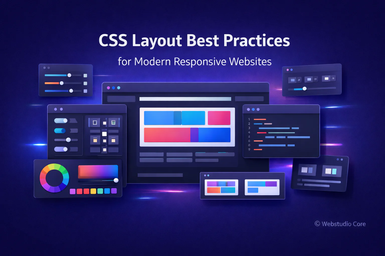
This article covers practical CSS layout best practices used by modern developers to create clean, responsive, and future-proof websites.
Why CSS Layout Best Practices Matter
Layout decisions define how content flows, adapts, and scales. Good layout practices reduce technical debt and make your CSS easier to maintain as a project grows.
Well-structured layouts help:
• Improve responsiveness across devices
• Reduce unnecessary wrapper elements
• Make CSS easier to read and debug
• Improve accessibility and usability
• Support long-term scalability
Think in Layout Structure First
Before writing any CSS, define the structure of your layout. Decide which parts of the page are structural (layout) and which parts are components (content).
A common approach is:
• Use CSS Grid for page-level layout
• Use Flexbox for internal alignment and components
This structure-first mindset makes layout logic clearer and prevents mixing layout rules with component styling.
Use CSS Grid for Page-Level Layout
CSS Grid is ideal for defining overall page structure. It allows you to control rows and columns explicitly, making complex layouts easier to manage.
Grid works best when:
• Layout has clear sections
• Rows and columns matter
• Content needs predictable placement
Use Flexbox for Alignment and Components
Flexbox excels at aligning items inside a container. It is perfect for navigation bars, button groups, cards, and UI components.
Flexbox should be used when:
• Layout flows in one direction
• Content size is dynamic
• Alignment is the main concern
Avoid Over-Nesting HTML Elements
Deeply nested HTML structures make layouts harder to manage and debug. Modern CSS allows you to achieve complex layouts with fewer elements.
Whenever possible:
• Avoid unnecessary wrapper divs
• Let layout systems do the work
• Keep HTML semantic and clean
Use Gap Instead of Margins for Layout Spacing
Modern CSS supports the gap property for both Grid and Flexbox. Using gap simplifies spacing logic and avoids margin-collapsing issues.
This approach improves consistency and readability across layouts.
Design Mobile-First Layouts
Mobile-first design starts with the smallest screen and progressively enhances the layout for larger devices. This results in simpler CSS and better performance.
Mobile-first layouts:
• Reduce unnecessary overrides
• Improve loading performance
• Encourage content prioritization
Keep Layout CSS Separate from Component Styling
Layout CSS should define structure and positioning, while component CSS should handle appearance and behavior.
Separating these concerns makes:
• Components easier to reuse
• Layout changes less risky
• Codebases easier to scale
Test Layouts with Real Content
Layouts that work with placeholder text often break with real content. Always test layouts using realistic text lengths and image sizes.
This helps prevent overflow issues and unexpected layout shifts.
Why Webstudio Core Emphasizes Layout Best Practices
Webstudio Core focuses on practical, long-term web development principles. Strong CSS layout foundations make every tool, component, and design system more reliable.
By following layout best practices, developers can build websites that remain stable, readable, and maintainable as they grow.
Final Thoughts
CSS layout best practices are not about following strict rules—they are about making thoughtful decisions that improve clarity, flexibility, and maintainability.
By combining CSS Grid for structure and Flexbox for alignment, keeping HTML clean, and designing mobile-first, you can create modern layouts that stand the test of time.