One of the most common questions in modern web development is whether to use CSS Flexbox or CSS Grid for layout design. Both are powerful, both are widely supported, and both solve layout problems—but in different ways.
Choosing the wrong layout system can make your CSS harder to maintain. Choosing the right one can simplify your code, improve responsiveness, and speed up development. This article explains the real differences between Flexbox and Grid, with practical guidance on when to use each.
Understanding the Core Difference
The fundamental difference between Flexbox and Grid lies in how they handle layout dimensions.
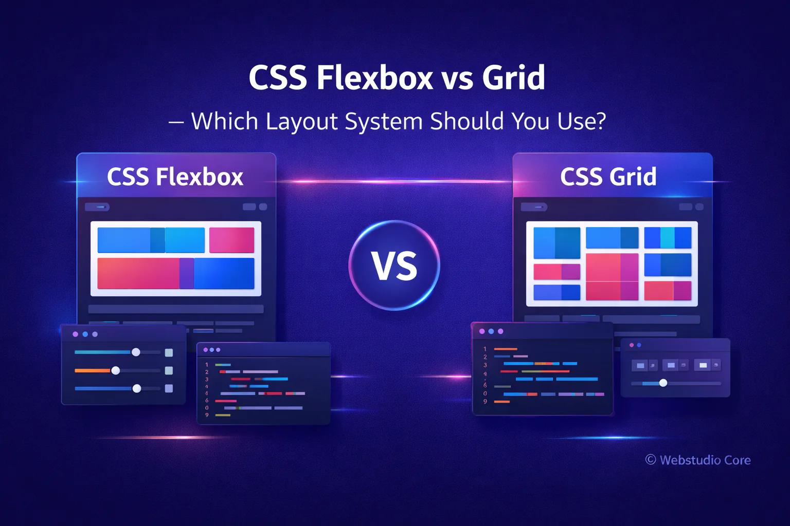
Flexbox is one-dimensional. It works along a single axis—either horizontal or vertical.
CSS Grid is two-dimensional. It controls both rows and columns at the same time.
This single distinction already determines most real-world use cases.
What Is CSS Flexbox Best For?
Flexbox is designed for layout in one direction. It excels when elements need to align, distribute space, or adapt dynamically along a single axis.
Flexbox works best for:
• Navigation bars and menus
• Button groups and toolbars
• Centering elements vertically and horizontally
• Small UI components
• Dynamic content with unknown size
Why Developers Like Flexbox
Flexbox feels intuitive and flexible. It adapts well when content size changes, which makes it ideal for components where the layout should respond naturally to content.
Flexbox is often the first choice for:
• Aligning items quickly
• Building reusable UI components
• Handling content-driven layouts
What Is CSS Grid Best For?
CSS Grid is designed for layout structure. It allows you to define rows and columns explicitly, making it ideal for complex and page-level layouts.
CSS Grid works best for:
• Full-page layouts
• Dashboards and admin interfaces
• Image galleries and portfolios
• Landing page sections
• Application-style layouts
Why Developers Prefer Grid for Layout Structure
Grid gives you precise control. You can design the layout first and place elements into it, rather than letting content define the structure.
This approach results in:
• Cleaner HTML structure
• Fewer wrapper elements
• More readable and maintainable CSS
• Better scalability for large layouts
Flexbox vs Grid: A Practical Comparison
Instead of asking which one is better, the real question is: which one fits the problem?
Use Flexbox when:
• Layout flows in one direction
• Content size is unpredictable
• Alignment is the main concern
Use CSS Grid when:
• Layout needs rows and columns
• Structure is more important than content flow
• You are designing page-level sections
Can Flexbox and Grid Be Used Together?
Yes—and this is how most modern websites are built.
A common and effective pattern is:
• Use CSS Grid for the main page layout
• Use Flexbox inside grid items for alignment and components
This combination provides both structural control and flexibility.
Which One Is Better for Responsive Design?
Both Flexbox and Grid support responsive design, but they approach it differently.
Flexbox adapts naturally as content changes size. Grid excels when you want layouts to rearrange at specific breakpoints.
In practice:
• Flexbox is great for fluid responsiveness
• Grid is excellent for breakpoint-based layouts
Flexbox vs Grid for Beginners
Beginners often find Flexbox easier to learn because it feels more predictable and forgiving. Grid has a steeper learning curve but offers greater power once understood.
A good learning path is:
• Learn Flexbox first
• Understand Grid after mastering layout basics
• Combine both in real projects
Using Generators to Learn Flexbox and Grid Faster
Visual generators for Flexbox and Grid can significantly reduce the learning curve. They allow you to see how layout changes affect structure in real time.
Many developers use generators to:
• Experiment with layouts quickly
• Understand how properties interact
• Generate a clean starting point for production code
Why Webstudio Core Covers Both Flexbox and Grid
Webstudio Core focuses on practical tools and resources for modern web creators. Flexbox and Grid are not competing technologies—they are complementary systems that solve different layout problems.
Understanding when and how to use each one is essential for building scalable, maintainable websites.
Final Thoughts
CSS Flexbox and CSS Grid are both essential tools in modern web development. The key is not choosing one over the other, but knowing when each one is appropriate.
Use Flexbox for alignment and components. Use Grid for structure and layout. Combine both for the best results.