Creating responsive layouts has always been one of the biggest challenges in web development. Modern websites must adapt to different screen sizes, devices, and orientations while maintaining consistency and usability.
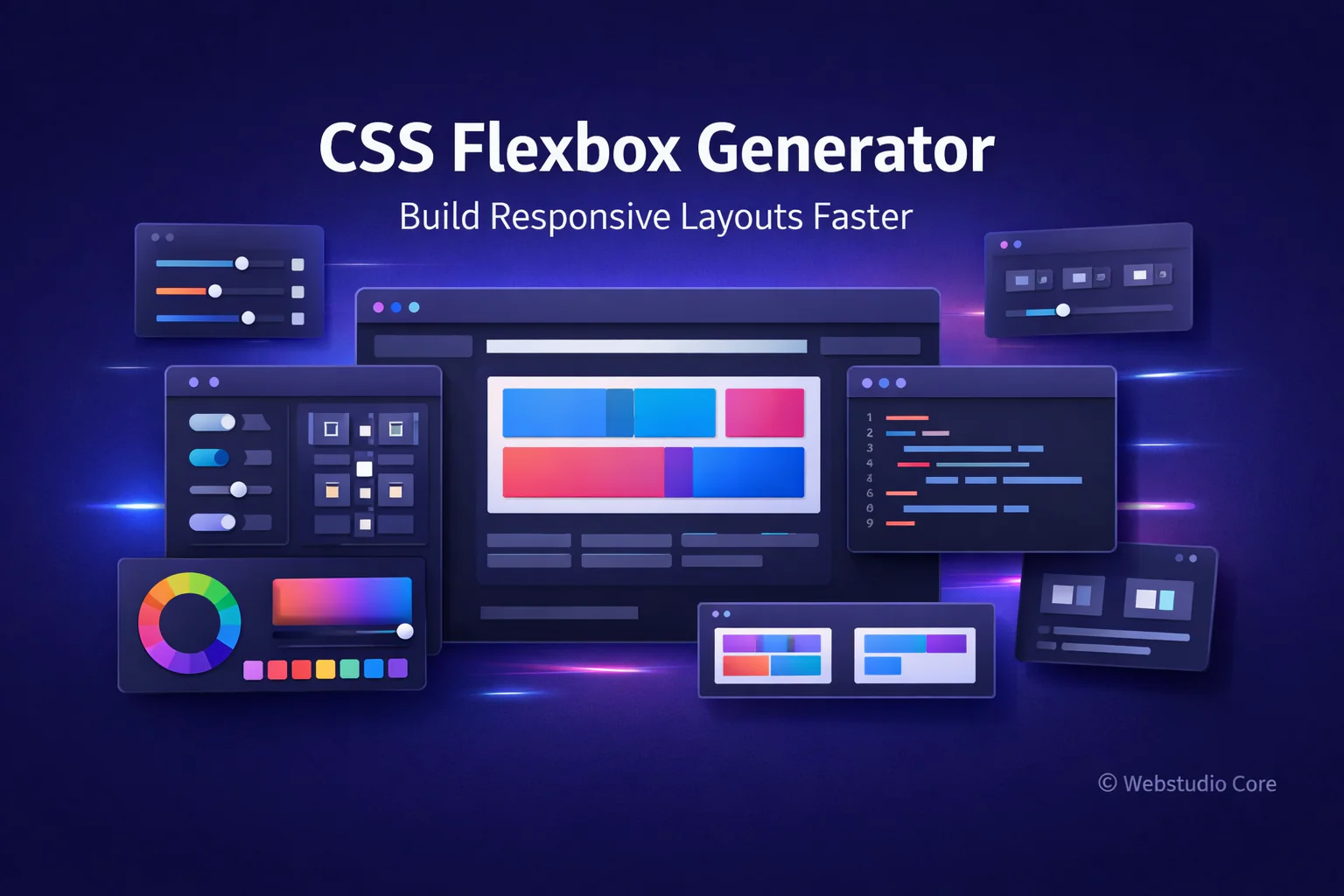
CSS Flexbox was designed to solve many of these problems. However, writing Flexbox layouts manually can still feel complex—especially when dealing with alignment, spacing, and direction rules. This is where a CSS Flexbox generator becomes extremely valuable.
What Is a CSS Flexbox Generator?
A CSS Flexbox generator is an online tool that allows you to build Flexbox-based layouts visually. Instead of memorizing properties like justify-content, align-items, or flex-direction, you can adjust layout settings using a visual interface.
As you make changes, the generator updates the layout preview in real time and produces clean CSS code that you can copy directly into your project.
Understanding CSS Flexbox in Simple Terms
Flexbox is a one-dimensional layout system designed to distribute space along a single axis—either horizontally or vertically. It is especially useful for building components, navigation bars, and responsive sections.
Flexbox works by defining a flex container and placing flex items inside it. The container controls how items are aligned, spaced, and resized.
Why Flexbox Is Essential for Modern Web Design
Flexbox has become a core part of modern CSS because it simplifies layout logic that was previously difficult or unreliable.
Flexbox helps developers:
• Align items vertically and horizontally with ease
• Create responsive layouts without floats
• Control spacing dynamically
• Build flexible UI components
• Reduce layout-related CSS hacks
Common Flexbox Properties Explained
A CSS Flexbox generator usually exposes the most important Flexbox properties in a visual way.
Flex Direction
This property defines the main axis of the layout. Items can be arranged in rows, columns, or reversed directions depending on the design needs.
Justify Content
Justify-content controls how items are spaced along the main axis. It is commonly used to center content or distribute space evenly.
Align Items
Align-items controls alignment on the cross axis. It helps align items vertically when using row layouts or horizontally in column layouts.
Flex Wrap
Flex-wrap determines whether items stay on one line or wrap onto multiple lines. This is crucial for responsive layouts.
Gap and Spacing
Modern Flexbox supports gap properties, making spacing between items cleaner and easier to manage without margins.
Benefits of Using a CSS Flexbox Generator
While Flexbox is powerful, it can feel overwhelming for beginners and even slow down experienced developers during experimentation.
Main benefits of using a Flexbox generator include:
• Instant visual feedback
• Faster layout experimentation
• No need to memorize Flexbox syntax
• Cleaner and more consistent CSS
• Reduced development time
How to Use a CSS Flexbox Generator
Using a CSS Flexbox generator typically follows this workflow:
1. Define the flex container
2. Choose layout direction (row or column)
3. Adjust alignment and spacing visually
4. Enable or disable wrapping
5. Preview the layout across different sizes
6. Copy the generated CSS code
CSS Flexbox Generator vs Manual Layout Coding
Manual Flexbox coding offers full control and is essential for complex systems. However, it can be inefficient when testing layout variations or building UI components repeatedly.
Flexbox generators excel at rapid prototyping and layout exploration. Many professionals use them to generate a base layout, then refine the code manually.
Best Use Cases for CSS Flexbox Generators
CSS Flexbox generators are ideal for:
• Navigation bars and menus
• Card layouts and content grids
• Centering elements vertically and horizontally
• Responsive UI components
• Dashboard and application layouts
Flexbox vs CSS Grid: When to Use Each
Flexbox and CSS Grid are often compared, but they serve different purposes. Flexbox is best for one-dimensional layouts, while CSS Grid excels at two-dimensional layouts.
In many real-world projects, both systems are used together to achieve optimal results.
Why Webstudio Core Focuses on Flexbox Generator Tools
Webstudio Core is built around tools that simplify modern web development without sacrificing performance. Flexbox generators align perfectly with this goal by helping users create responsive layouts quickly and efficiently.
All generated code is designed to be lightweight, readable, and suitable for production environments.
Final Thoughts
A CSS Flexbox generator is an essential tool for building modern, responsive layouts. It removes friction from layout design and allows creators to focus on structure, usability, and visual clarity.
Whether you are new to Flexbox or an experienced developer, using a Flexbox generator can significantly improve your workflow and confidence when building responsive designs.